Menu
ASTRO
03.2026
Year
2026
Timeframe
3 Weeks
Project Type
School
Tools Used
Figma
About
ASTRO is a blog that allows users to read about the latest news pertaining to astronomical science.
Challenge
Select then audit an existing astronomy blog website. Determine what is working and areas for improvement. Create responsive wireframes for a home, about, and contact page that improve upon the audited site. Design and prototype the site.
Research
I audited astronomy.com and identified the several areas for improvement. I felt the site’s navigation lacked clear organization and should have included access to the contact and about pages. The home page layout felt crowded and overwhelming and the contact page included too much type. The site’s about page contained an image carousel, which can be difficult for screen readers to interpret. The overall design also felt outdated.
Wireframes
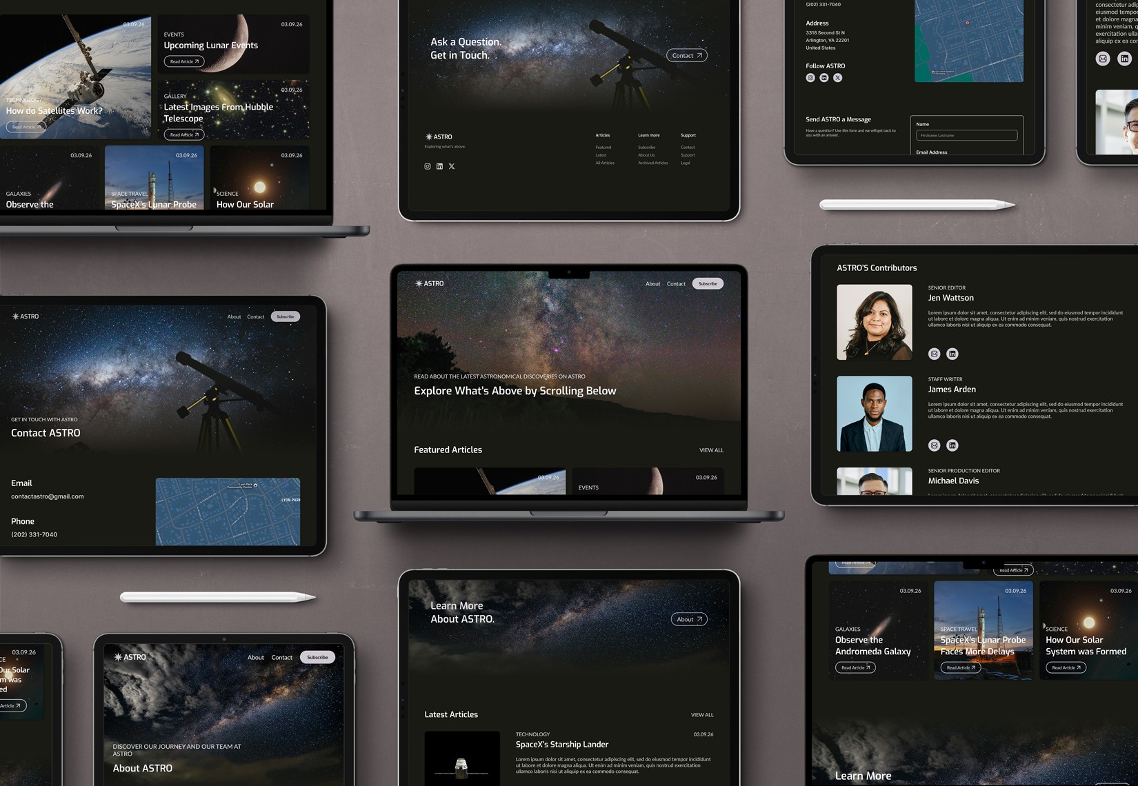
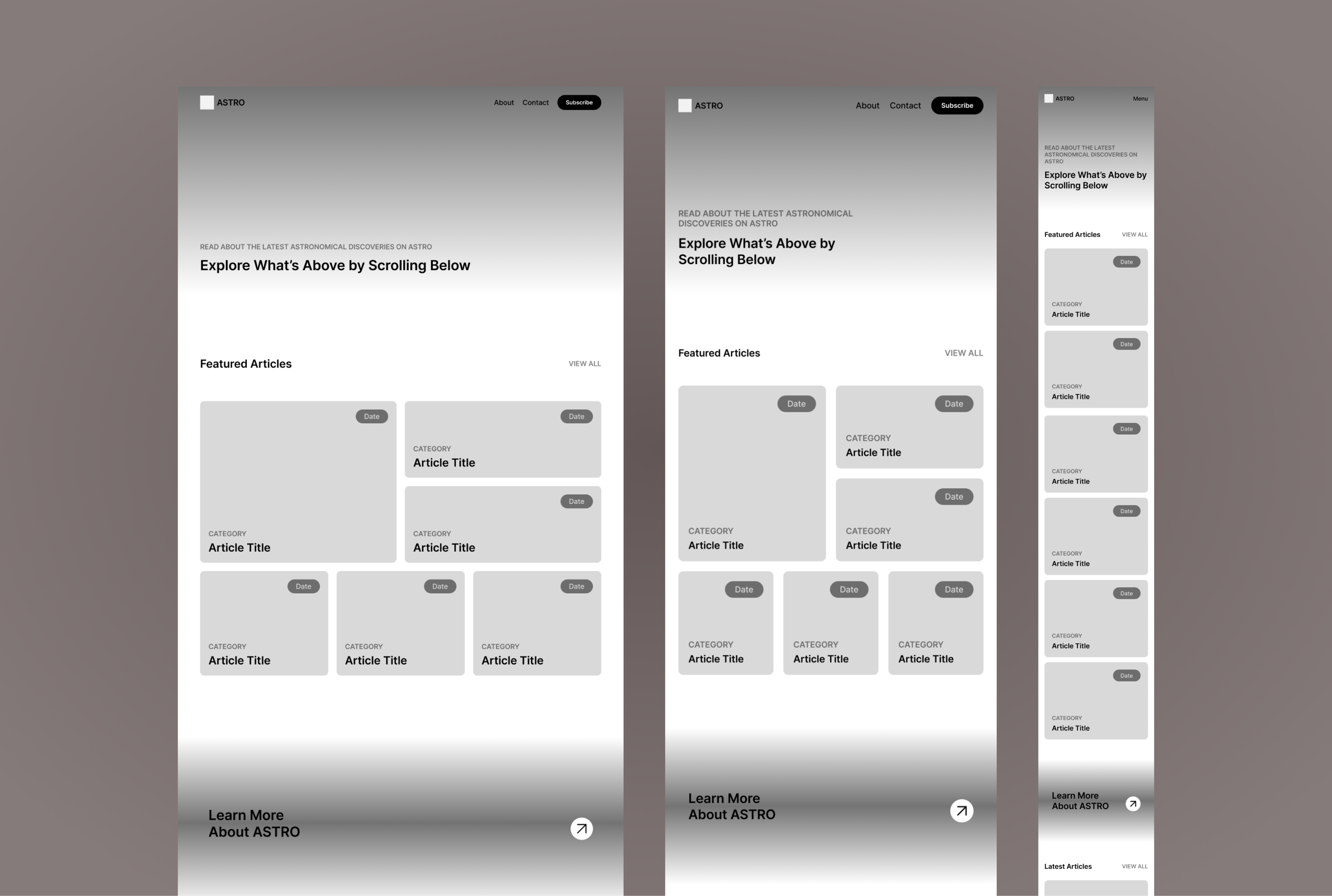
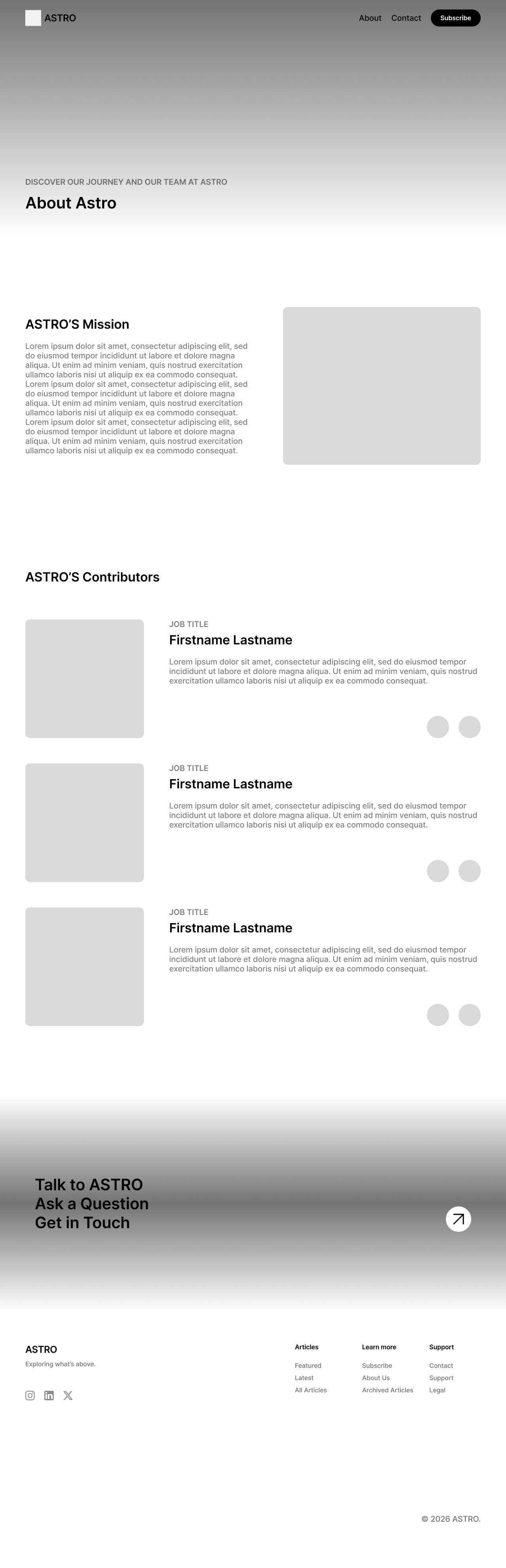
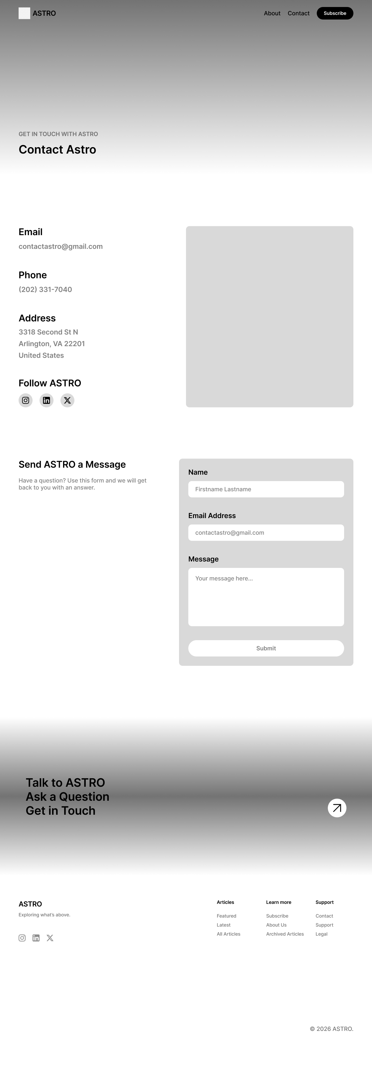
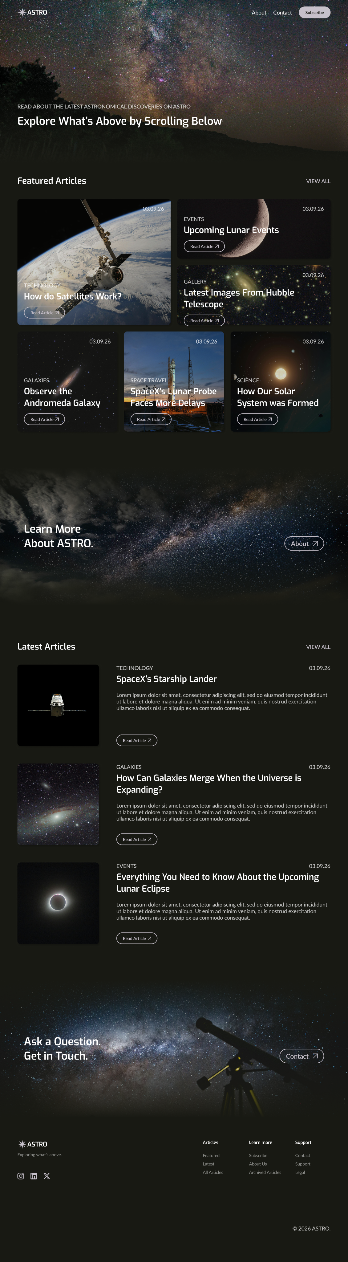
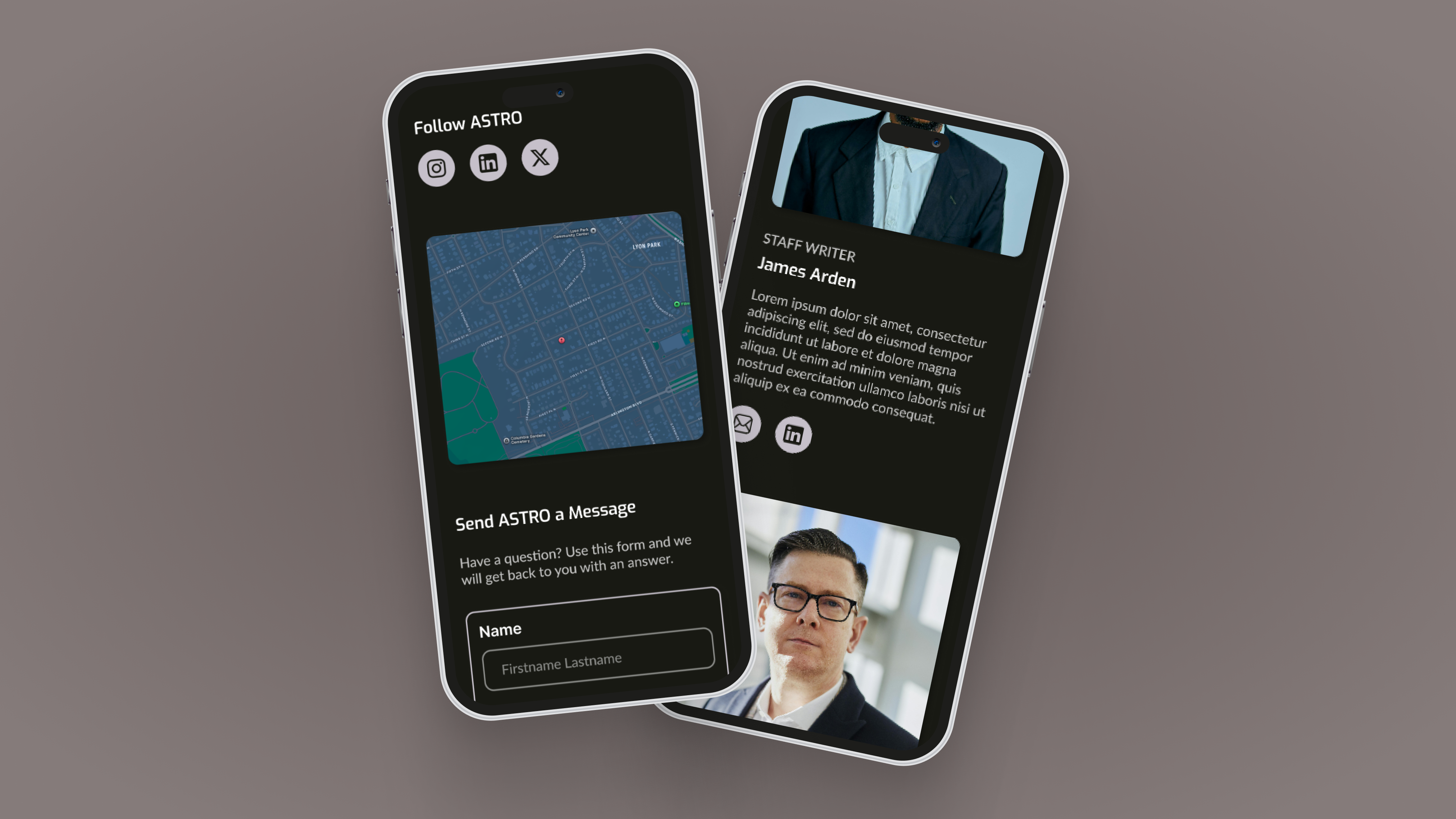
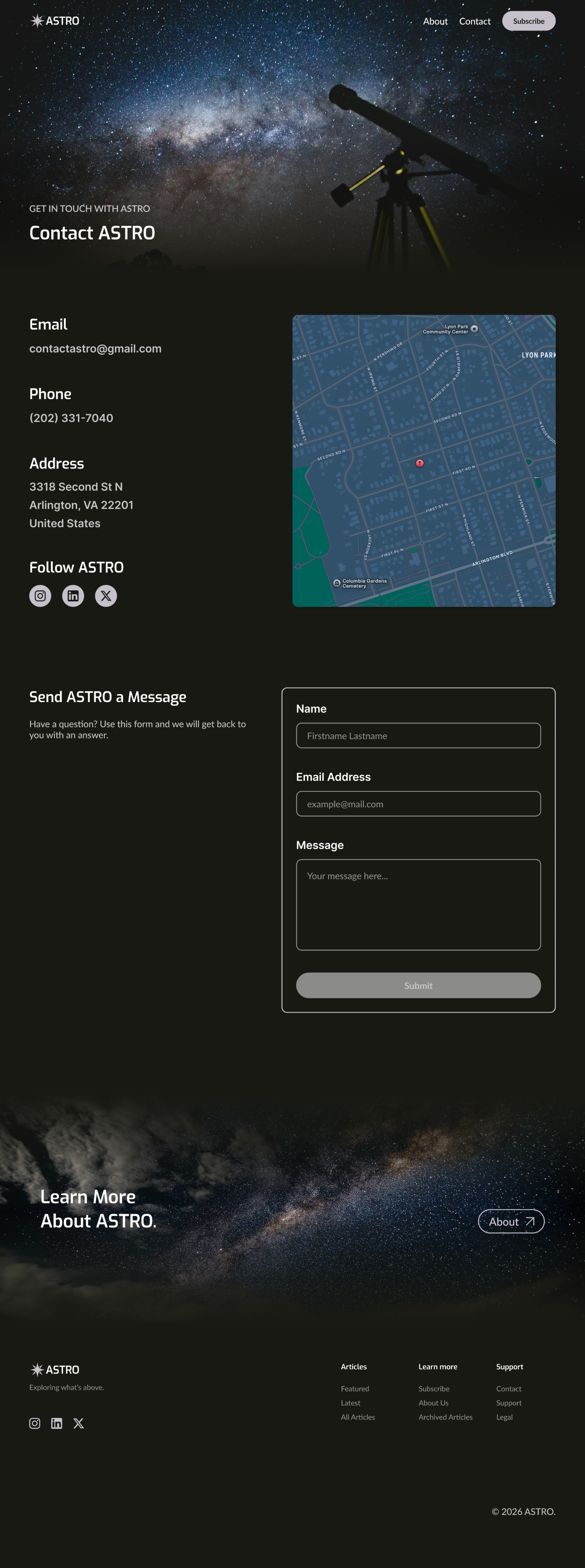
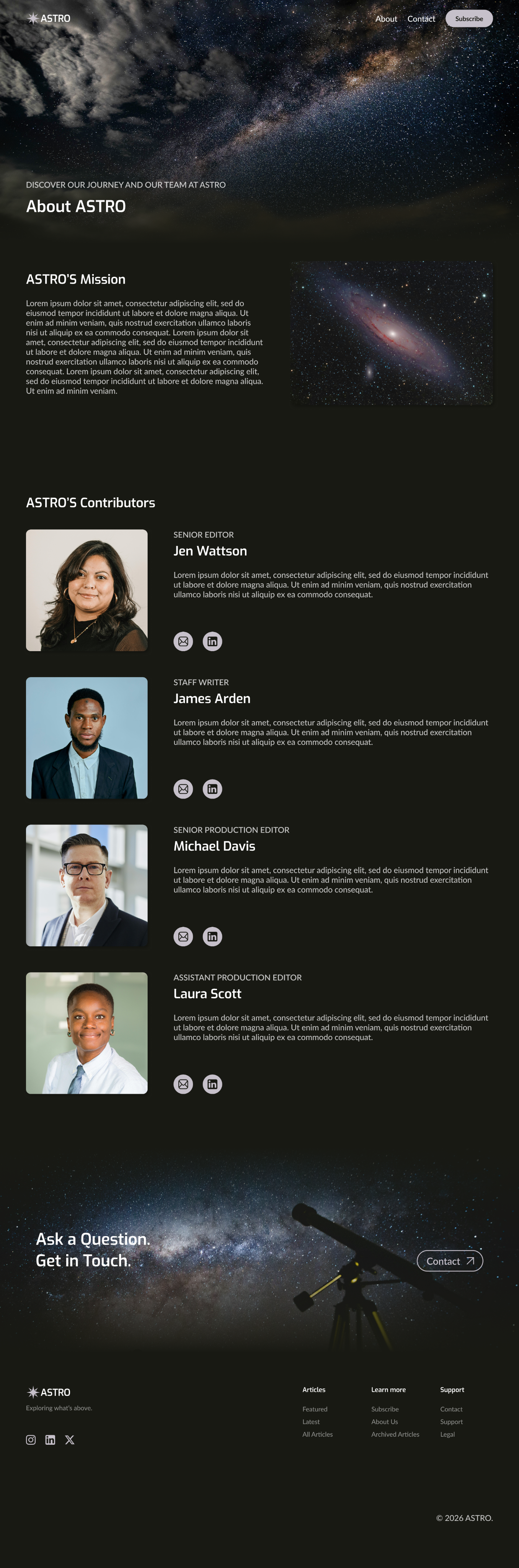
I designed ASTRO’s wireframes with the improvements from my audit in mind. I reduced the amount of pages in the main navigation. I overlayed the featured article’s information on it’s images, so they would act as containers. I converted the latest articles into a list, rather than grid, and added the option to “view more,” rather than cramming them all into the home page. I added a place for a map and contact form to help limit the text on the contact page and I rearranged the about page’s carousel to a list.
Design
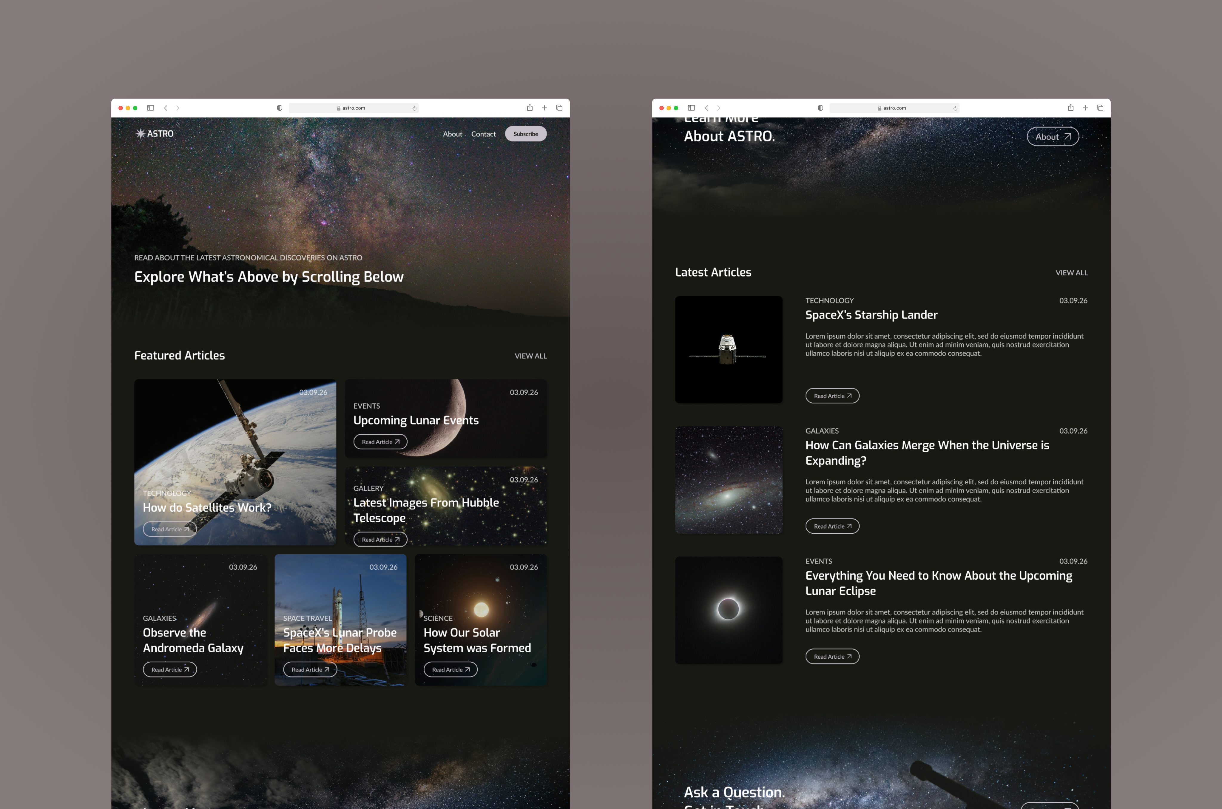
I began by creating a mood board to help me determine the colors, typeface, and general aesthetic that I planned to use. I chose a dark interface to match the space branding and used rounded edges and shadows to help the site feel more modern. I decided to include image based heros and CTAs to add visual interest and draw in a user’s attention, and I additionally included more images and visual elements on the about and contact pages to balance out the text.
Interactions
While conducting my audit, I noticed the lack of indicators when hovering/selecting a button or article. I adjusted the button fill to indicate hovering/pressing and added a darker overlay to the articles when hovering/pressing them.
Results
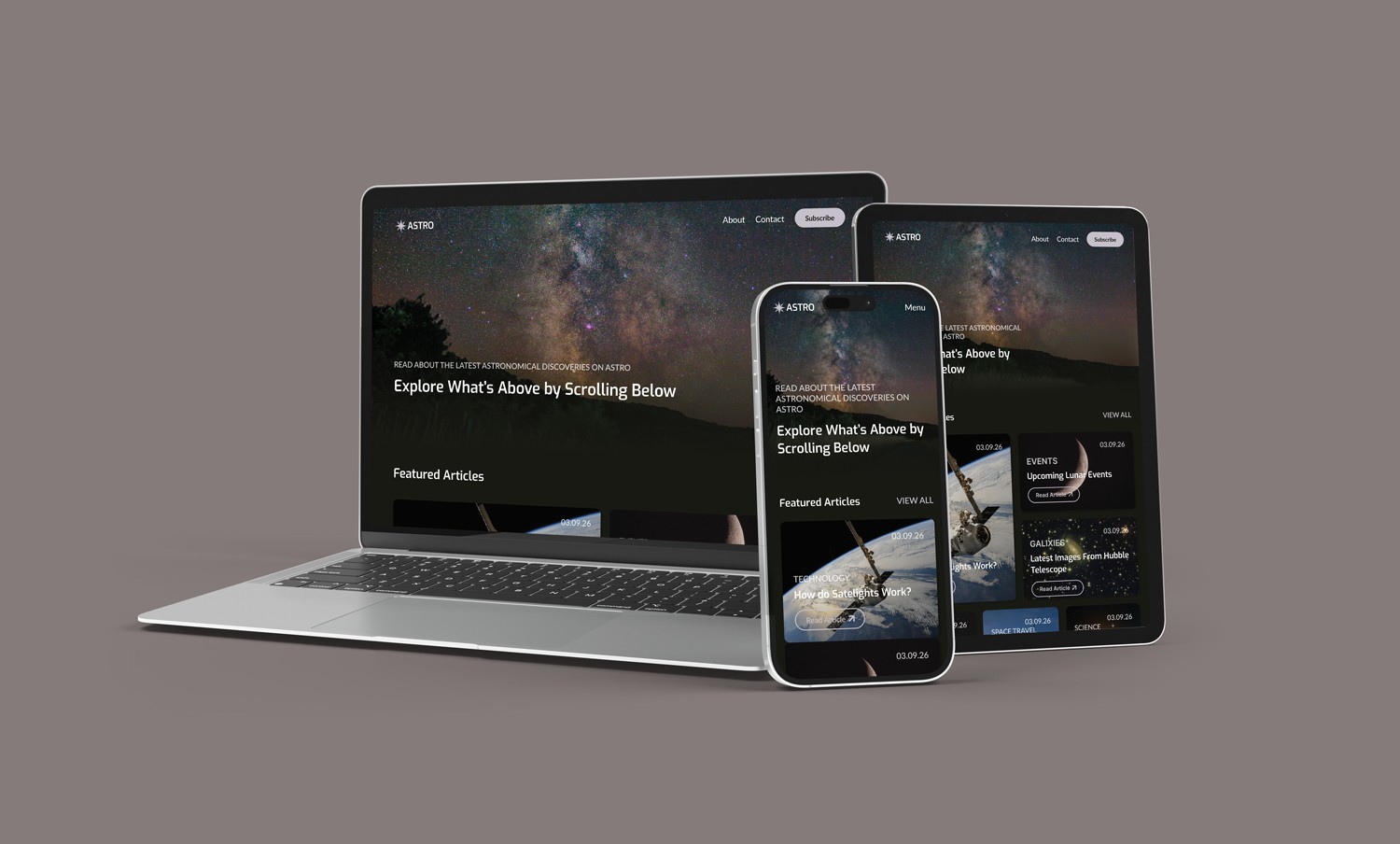
Designing ASTRO has improved my ability to display a brand and its personality within an interface, rather than adding a logo to a generic design. This project has additionally helped improve my ability to rearrange layouts to ensure a site is responsive and properly functions for varying device sizes.
ASTRO
03.2026
Year
2026
Timeframe
3 Weeks
Project Type
School
Tools Used
Figma
About
ASTRO is a blog that allows users to read about the latest news pertaining to astronomical science.
Challenge
Select then audit an existing astronomy blog website. Determine what is working and areas for improvement. Create responsive wireframes for a home, about, and contact page that improve upon the audited site. Design and prototype the site.
Research
I audited astronomy.com and identified the several areas for improvement. I felt the site’s navigation lacked clear organization and should have included access to the contact and about pages. The home page layout felt crowded and overwhelming and the contact page included too much type. The site’s about page contained an image carousel, which can be difficult for screen readers to interpret. The overall design also felt outdated.
Wireframes
I designed ASTRO’s wireframes with the improvements from my audit in mind. I reduced the amount of pages in the main navigation. I overlayed the featured article’s information on it’s images, so they would act as containers. I converted the latest articles into a list, rather than grid, and added the option to “view more,” rather than cramming them all into the home page. I added a place for a map and contact form to help limit the text on the contact page and I rearranged the about page’s carousel to a list.
Design
I began by creating a mood board to help me determine the colors, typeface, and general aesthetic that I planned to use. I chose a dark interface to match the space branding and used rounded edges and shadows to help the site feel more modern. I decided to include image based heros and CTAs to add visual interest and draw in a user’s attention, and I additionally included more images and visual elements on the about and contact pages to balance out the text.
Interactions
While conducting my audit, I noticed the lack of indicators when hovering/selecting a button or article. I adjusted the button fill to indicate hovering/pressing and added a darker overlay to the articles when hovering/pressing them.
Results
Designing ASTRO has improved my ability to display a brand and its personality within an interface, rather than adding a logo to a generic design. This project has additionally helped improve my ability to rearrange layouts to ensure a site is responsive and properly functions for varying device sizes.