Menu
HapWare
03.2026

Duration
2 Months
Role
Web Designer
Project Type
Client
Tools Used
Wordpress.org
About
HapWare created the first ever assistive device that translates non-verbal social cues into physical touch for individuals who blind, deaf-blind, or neurodiverse.
The Problem
HapWare’s current website isn’t accessible to their primary customer demographic: individuals with vision differences.
Research
Through user interviews and research, I aim to:
- Discover what makes HapWare’s current website inaccessible to those with vision differences
- Understand common frustrations that users with vision differences have when accessing websites or apps
- Learn about what to implement and what to avoid in a site for people with vision differences
Unavailablilty
HapWare’s users showed me how there site had some spots with color contrast, screen reader, and alternative text issues.
Frustrations
Those interviewed had an extensive list of ways in which sites that they accessed were not accessible to them, including:
- No alt text
- Unlabeled or mislabeled Buttons/links
- Small text sizes
- Improper hierarchy
- Image Carousels
- Audio that starts automatically
Have/Avoid
After conducting research, I compiled a list of what to have and what to avoid.
Have:
- Clear structure
- Descriptive labels
- High contrast
- Large text
- Gaps between sections
- Alt text
- Consistency
Avoid:
- Ambiguity
- Complex layouts
- Automatic audio/video/carousels
Wireframes
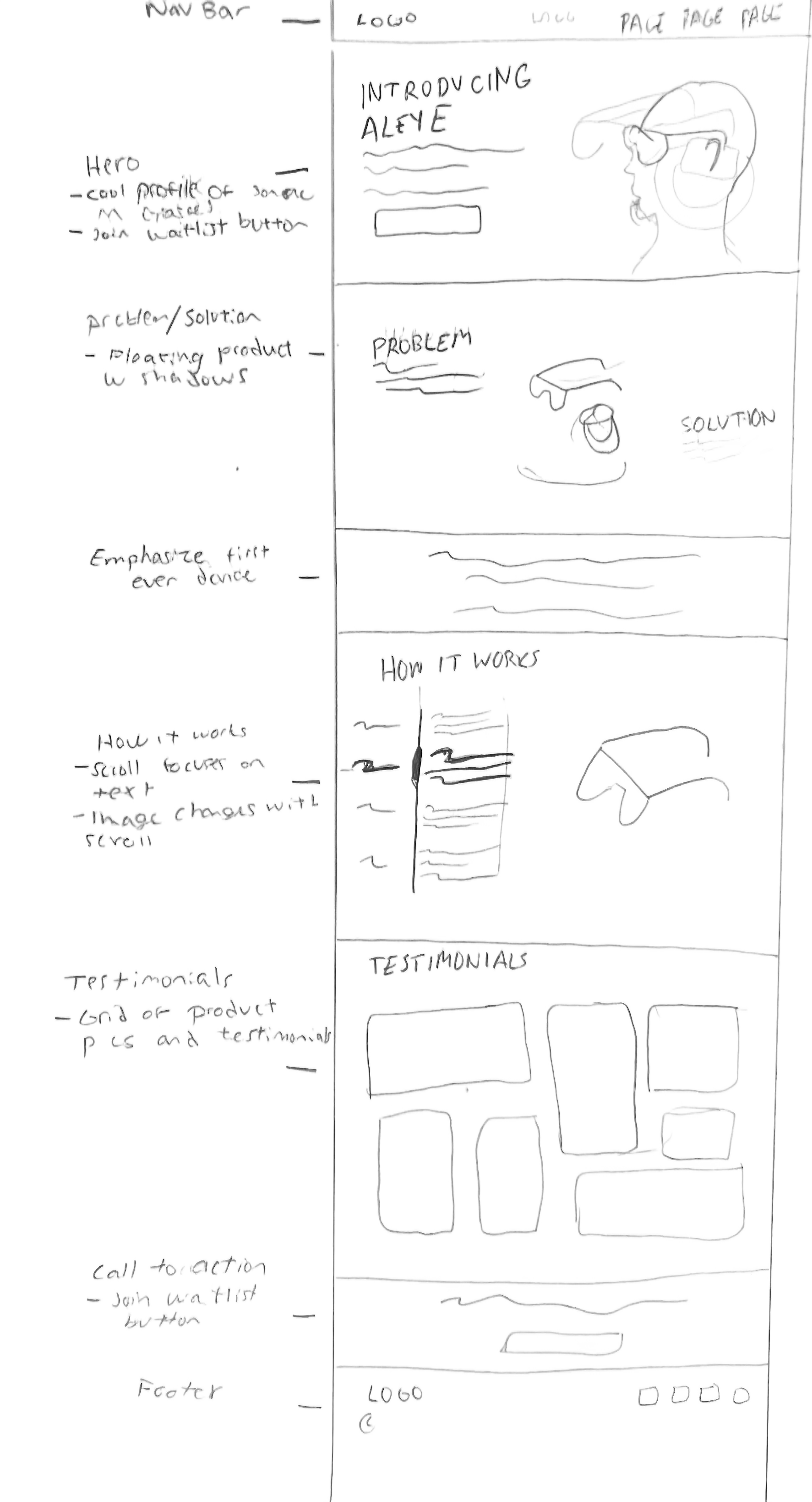
Initial sketch that focuses on laying out the structure for the following key page:
Landing Page
While creating the initial design for the landing page, I tried to keep a few things in mind. I wanted the structure to follow that of a traditional landing page and not do anything too unique to limit potential areas for issues with screen readers. The “How it Works” section was swiftly revised into a less complex layout. I also had to be mindful of the image I selected for the hero to ensure high contrast. As I created this sketch I repeatedly referred back to my initial research, ensuring I was avoiding the common ways in which websites are inaccessible to those with vision differences.
Design
Initial sketch that focuses on laying out the structure for the following key page:
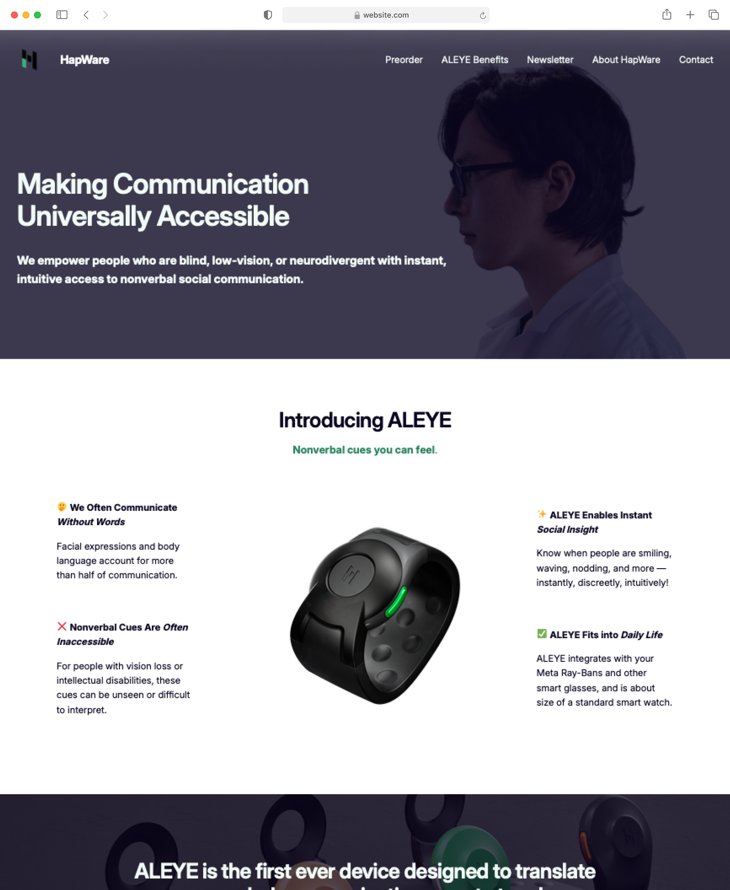
Landing Page
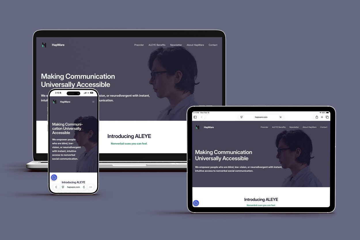
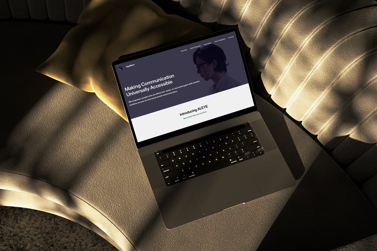
HapWare’s landing page is designed to optimally work with a screen reader. It features a clear structure with detailed alt text labels to ensure that their users can easily navigate the site. There is high contrast text for low vision users who might not use a screen reader. The elements on the landing page remain consistent throughout the site to limit confusion.
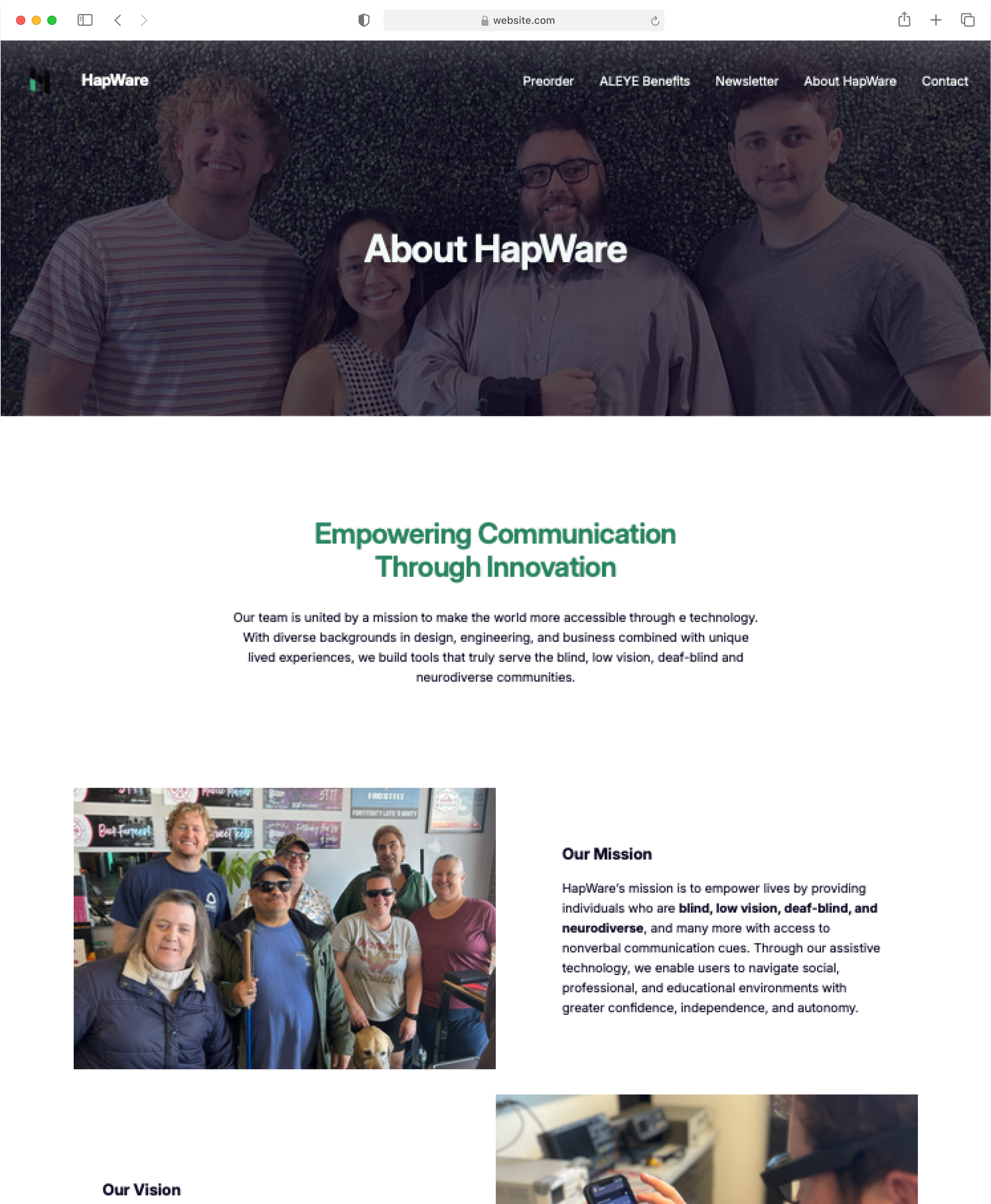
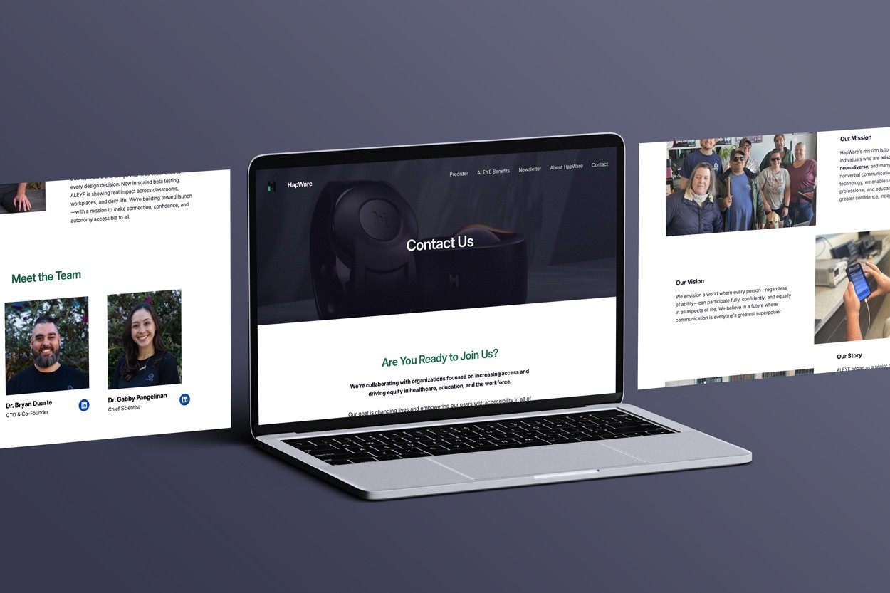
About Page
HapWare’s about page contains large gaps between each section and clear hierarchy to make it easy for users to navigate and to help them build a clear mental map of the site. Like the landing page, the about page features high contrast text as well as detailed alternative text.
User Testing
- What parts need to be adjusted for the screen reader?
- What information do users want from alternative text?
- How easily are users able to follow the structure of the website?
- Are there any parts of the site that are inaccessible?
Feedback and Improvements
Testing the site with some of HapWare’s clients was mandatory. I needed to ensure that the website was not just passing, but exceeding accessibility standards. Throughout testing, users provided multiple areas for layout adjustments that would improve the function of screen readers. I was also able to better understand what information was desired from alternative text for buttons, links, and images. Improvements for the site primarily included basic color and layout adjustments, improved labels, and clearer navigation.
Takeaways
Designing HapWare’s website was a challenge that I am utterly grateful I had the opportunity to take on. After speaking with their clients, I gained a new perspective on accessibility. It no longer meant checking off the minimum requirements, but rather it meant including the needs of marginalized demographics from start to finish.
This project’s primary user basis were those with vision impairments. My next project will likely target a different demographic, however, I will work to the best of my ability to design a solution that is accessible. The frustrations that HapWare’s clients expressed regarding accessing websites and apps were disturbingly abundant. Although I have a lot more to learn about creating inclusive designs, working on this project for HapWare was an opportunity that began to teach me ways that I can avoid contributing to vast realm of inaccessible design.
HapWare
03.2026
Duration
2 Months
Role
Web Designer
Project Type
Client
Tools Used
Wordpress.org
About
HapWare created the first ever assistive device that translates non-verbal social cues into physical touch for individuals who blind, deaf-blind, or neurodiverse.
The Problem
HapWare’s current website isn’t accessible to their primary customer demographic: individuals with vision differences.
Research
Through user interviews and research, I aim to:
- Discover what makes HapWare’s current website inaccessible to those with vision differences
- Understand common frustrations that users with vision differences have when accessing websites or apps
- Learn about what to implement and what to avoid in a site for people with vision differences
Inaccessiblity
HapWare’s users showed me how there site had some spots with color contrast, screen reader, and alternative text issues.
Frustrations
Those interviewed had an extensive list of ways in which sites that they accessed were not accessible to them, including:
- No alt text
- Unlabeled or mislabeled Buttons/links
- Small text sizes
- Improper hierarchy
- Image Carousels
- Audio that starts automatically
Have/Avoid
After conducting research, I compiled a list of what to have and what to avoid.
Have:
- Clear structure
- Descriptive labels
- High contrast
- Large text
- Gaps between sections
- Alt text
- Consistency
Avoid:
- Ambiguity
- Complex layouts
- Automatic audio/video/carousels
Wireframes
Initial sketch that focuses on laying out the structure for the following key page:
Landing Page
While creating the initial design for the landing page, I tried to keep a few things in mind. I wanted the structure to follow that of a traditional landing page and not do anything too unique to limit potential areas for issues with screen readers. The “How it Works” section was swiftly revised into a less complex layout. I also had to be mindful of the image I selected for the hero to ensure high contrast. As I created this sketch I repeatedly referred back to my initial research, ensuring I was avoiding the common ways in which websites are inaccessible to those with vision differences.
Design
Initial sketch that focuses on laying out the structure for the following key page:
Landing Page
HapWare’s landing page is designed to optimally work with a screen reader. It features a clear structure with detailed alt text labels to ensure that their users can easily navigate the site. There is high contrast text for low vision users who might not use a screen reader. The elements on the landing page remain consistent throughout the site to limit confusion.
About Page
HapWare’s about page contains large gaps between each section and clear hierarchy to make it easy for users to navigate and to help them build a clear mental map of the site. Like the landing page, the about page features high contrast text as well as detailed alternative text.
User Testing
- What parts need to be adjusted for the screen reader?
- What information do users want from alternative text?
- How easily are users able to follow the structure of the website?
- Are there any parts of the site that are inaccessible?
Feedback and Improvements
Testing the site with some of HapWare’s clients was mandatory. I needed to ensure that the website was not just passing, but exceeding accessibility standards. Throughout testing, users provided multiple areas for layout adjustments that would improve the function of screen readers. I was also able to better understand what information was desired from alternative text for buttons, links, and images. Improvements for the site primarily included basic color and layout adjustments, improved labels, and clearer navigation.
Takeaways
Designing HapWare’s website was a challenge that I am utterly grateful I had the opportunity to take on. After speaking with their clients, I gained a new perspective on accessibility. It no longer meant checking off the minimum requirements, but rather it meant including the needs of marginalized demographics from start to finish.
This project’s primary user basis were those with vision impairments. My next project will likely target a different demographic, however, I will work to the best of my ability to design a solution that is accessible. The frustrations that HapWare’s clients expressed regarding accessing websites and apps were disturbingly abundant. Although I have a lot more to learn about creating inclusive designs, working on this project for HapWare was an opportunity that began to teach me ways that I can avoid contributing to vast realm of inaccessible design.
HapWare
03.2026
Duration
2 Months
Role
Web Designer
Project Type
Client
Tools Used
Wordpress.org
About
HapWare created the first ever assistive device that translates non-verbal social cues into physical touch for individuals who blind, deaf-blind, or neurodiverse.
The Problem
HapWare’s current website isn’t accessible to their primary customer demographic: individuals with vision differences.
Research
Through user interviews and research, I aim to:
- Discover what makes HapWare’s current website inaccessible to those with vision differences
- Understand common frustrations that users with vision differences have when accessing websites or apps
- Learn about what to implement and what to avoid in a site for people with vision differences
Inaccessibility
HapWare’s users showed me how there site had some spots with color contrast, screen reader, and alternative text issues.
Frustrations
Those interviewed had an extensive list of ways in which sites that they accessed were not accessible to them, including:
- No alt text
- Unlabeled or mislabeled Buttons/links
- Small text sizes
- Improper hierarchy
- Image Carousels
- Audio that starts automatically
Have/Avoid
After conducting research, I compiled a list of what to have and what to avoid.
Have:
- Clear structure
- Descriptive labels
- High contrast
- Large text
- Gaps between sections
- Alt text
- Consistency
Avoid:
- Ambiguity
- Complex layouts
- Automatic audio/video/carousels
Wireframes
Initial sketch that focuses on laying out the structure for the following key page:
Landing Page
While creating the initial design for the landing page, I tried to keep a few things in mind. I wanted the structure to follow that of a traditional landing page and not do anything too unique to limit potential areas for issues with screen readers. The “How it Works” section was swiftly revised into a less complex layout. I also had to be mindful of the image I selected for the hero to ensure high contrast. As I created this sketch I repeatedly referred back to my initial research, ensuring I was avoiding the common ways in which websites are inaccessible to those with vision differences.
Design
Initial sketch that focuses on laying out the structure for the following key page:
Landing Page
HapWare’s landing page is designed to optimally work with a screen reader. It features a clear structure with detailed alt text labels to ensure that their users can easily navigate the site. There is high contrast text for low vision users who might not use a screen reader. The elements on the landing page remain consistent throughout the site to limit confusion.
About Page
HapWare’s about page contains large gaps between each section and clear hierarchy to make it easy for users to navigate and to help them build a clear mental map of the site. Like the landing page, the about page features high contrast text as well as detailed alternative text.
User Testing
- What parts need to be adjusted for the screen reader?
- What information do users want from alternative text?
- How easily are users able to follow the structure of the website?
- Are there any parts of the site that are inaccessible?
Feedback and Improvements
Testing the site with some of HapWare’s clients was mandatory. I needed to ensure that the website was not just passing, but exceeding accessibility standards. Throughout testing, users provided multiple areas for layout adjustments that would improve the function of screen readers. I was also able to better understand what information was desired from alternative text for buttons, links, and images. Improvements for the site primarily included basic color and layout adjustments, improved labels, and clearer navigation.
Takeaways
Designing HapWare’s website was a challenge that I am utterly grateful I had the opportunity to take on. After speaking with their clients, I gained a new perspective on accessibility. It no longer meant checking off the minimum requirements, but rather it meant including the needs of marginalized demographics from start to finish.
This project’s primary user basis were those with vision impairments. My next project will likely target a different demographic, however, I will work to the best of my ability to design a solution that is accessible. The frustrations that HapWare’s clients expressed regarding accessing websites and apps were disturbingly abundant. Although I have a lot more to learn about creating inclusive designs, working on this project for HapWare was an opportunity that began to teach me ways that I can avoid contributing to vast realm of inaccessible design.